
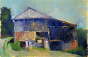
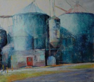
The deeper her exploration of painting, the more Carol Tippit Woolworth learns to omit from her works. Hers is a quest for the deepest and truest emotion that strikes her when she’s gazing at a pastoral landscape.
Basic shapes rendered with distinct mixtures of colors have come to fuel her work. Whether she’s painting fields and villages in the French countryside, recreating the landscapes of Lancaster County or visually exploring the Atlantic marshes, her palette (introduced to her 30 years ago) consists of 12 mixed colors: two rows of six colors each, from a light yellow on one side to a dark violet on the other.
“All of those are mixed,” the Wilmington resident says. “Nothing comes out of the tube directly. The paintings are all a combination of these colors. And each artist who mixes this palette can tailor it specifically to her own color sense, while remaining within a specific structure. And then within the established group of colors, you can mix across the lines.”

In her home studio, she paints from photographs she has taken. Visions of geometrically pleasing French fields, of villages in the distance, are a particular favorite of hers. Some such paintings fuse points of perspective, with lines and shapes narrowing in the distance, then flattening as if being viewed from above.
“I just loved the geometry of the fields and the villages,” Woolworth says. “I love when you’re looking up towards the horizon, and everything starts getting into these layers of colors. And that’s what I was enjoying with the marshes, which is similar to what I was doing with the French landscapes. You just get these little bands of colors at the top where everything starts separating instead of being this great big mish-mash.”
She’s been influenced by a lineage of artists, and Richard Diebenkorn’s work is particularly dear to her. When she was browsing a Matisse exhibition, she noticed a piece that bore a similarity to Diebenkorn’s style. She read the label and learned it was a painting Diebenkorn had examined many times. The image flattened rather than receded into the horizon. She says it’s like “looking down on something and up at it at the same time.”
Woolworth has run her own graphic design company for 25 years, and so she’s happy using tools such as T-squares and triangles or computer programs. Geometry appeals to her, she says, “because my brain’s kind of loopy.” It allows her to create order “from chaos.”
Oil on paper, Woolworth says, allows for a saturation of colors that is more intense than on canvas. The pigments sit on the surface rather than sinking into the fabric.
She’s been experimenting on wood panels, and when she returned to a big canvas she found it wasn’t as satisfying. Lately, she’s been working on medium-sized wood panels. It’s an accessible material.
“You can go to Home Depot and get a piece of plywood,” she says. “You just have to prime it and sand it.”
In April, she had an exhibition called “Local Color” at Blue Streak Gallery in Trolley Square. She enjoys closely cropping her paintings, and so most of the works on paper in that show were 5-by-7-inches to 10-by-14-inches.
With the Division’s grant, Woolworth is delving into a conceptual project that focuses on shapes — a bottle, for instance — and stems more from her mind than from sheer observation. In June 2013, she says, those pieces will be displayed in the Mezzanine Gallery at the Carvel State Office Building.
Masters
Established
Emerging
Related Topics: arts fellowship, arts grants, dance, Delaware, delaware division of the arts, Department of State, Division of the Arts, emerging artist, fellowship, fiction, folk arts, literary arts, literature, media arts, music, performing arts, poetry, recipient, State of Delaware, visual arts
Carvel State Office Building
820 North French Street,
4th Floor
Wilmington, DE 19801
302.577.8278 |
302.577.6561
Email Us
FOIA Request Form
Delaware's Governor
State Agencies
Elected Officials
General Assembly
Delaware Courts
State Employees
Cities & Towns
Delaware State Code
State Regulations
Business First Steps
Phone Directory
Locations Directory
Public Meetings
Voting & Elections
Transparency
Delaware Marketplace
Tax Center
Personal Income Tax
Privacy Policy
Weather & Travel
Contact Us
Corporations
Franchise Tax
Gross Receipts Tax
Withholding Tax
Delaware Topics
Help Center
Mobile Apps
E-mail / Text Alerts
Social Media

Built by the Government Information Center
©MMXXIV Delaware.gov