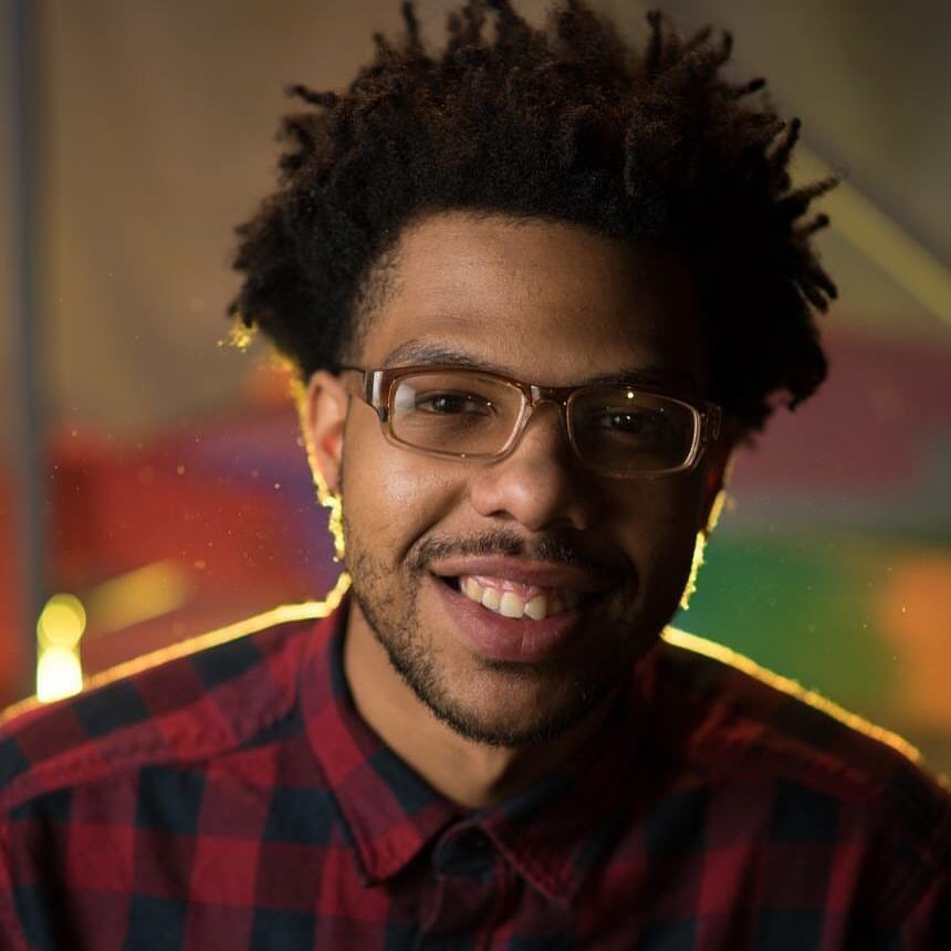
When Terrance Vann describes his paintings in terms of their rhythm, he isn’t merely borrowing an old trope.
He played trombone from the fourth through twelfth grade, moving from orchestral music to jazz. He played jazz band in high school, where he also tried his hand at bass guitar. By his junior year, Vann was feeling burned out, musically speaking. He wanted to try something new.
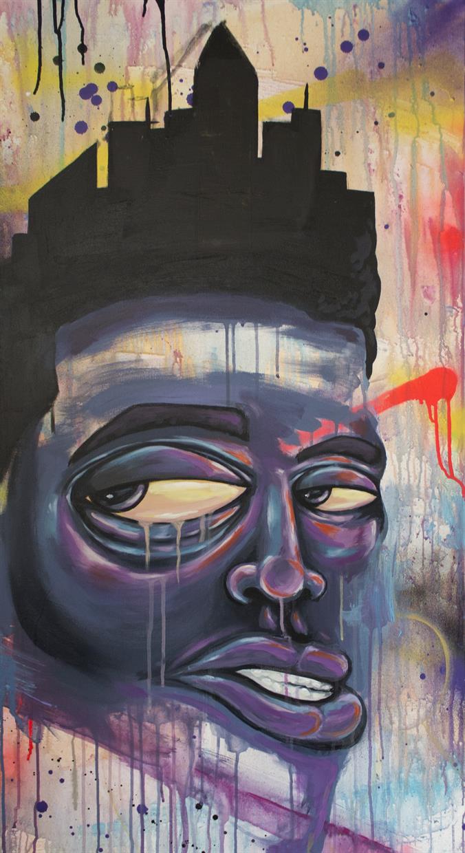
He’d been sketching throughout his life, but he decided that there was something deeper there. He started focusing his energy on art. His sense for music worked its way into his concepts. The characters he depicts in boldly colored settings seem like still frames from animated music videos. His use of drips and other graffiti-like elements evoke street art.
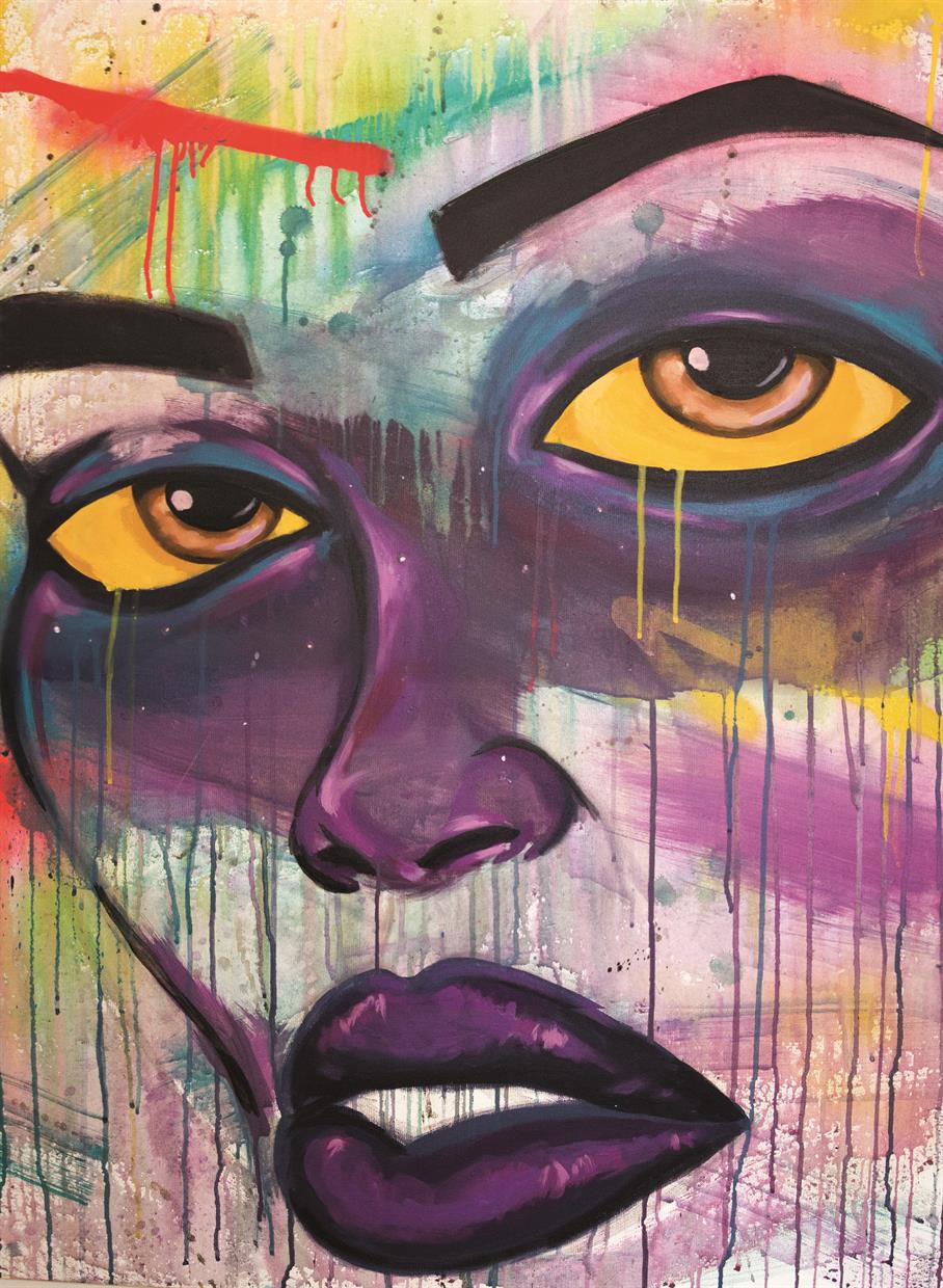
“When I do a face,” says Vann, of Wilmington, “I’ll have a nose drooping a little bit to the right, an eye shifted a little bit to the left, and the hair has a little curve to it. It’s still, but I want it to look like it’s undulating or dancing. It’s not static. I put a lot of stuff in the middle, in the forefront, and that’s kinda the most static thing you can do in art. So I try to establish a rhythm within the figure itself that guides your eye from the top left corner to the bottom right corner, whether it’s the color that’s used or the composition. I try to have the viewer’s eyes do a Z pattern.”
Purple dominates many of his paintings. Aesthetically, Vann considers it a color that “sits right in the middle,” neither hot nor cold. Mild yellows and greens work similarly for him, but he finds purple the most captivating color of the three.
“When you look at something that has a strong purple tone,” he says, “you have to really look at it. You have to look at it deeper. Because when something is bright red, or bright blue, that’s an identity right there. But purple makes you think, because visually, it’s not giving you the direct cues that reds, blues or cool colors give you. I try to draw people in using purple because it’s that nice, middle of the line pretty color. But I’ve learned that it’s a very mystical color, it’s a very spiritual color, it’s the color of passion. Once I saw how that coincided with my work, I kind of stuck with it because it was speaking to me when I was painting.”

Lately, Vann has been playing with hues of yellow and orange. He uses some spraypaints, but mostly he paints with acrylics — many of his favorites are from Liquitex Basics, which he finds hold a lot of pigment and are inexpensive. (“They have a magenta and a light violet that just sit together well,” he says.)
He tends to apply a unique concept to each series of paintings. With a recent series called “Intervisions,” for example, he wanted to speak to the spiritual connection that accompanies art — where do the ideas originate? how do they manifest? Each painting in such a series, he says, becomes like a chapter in a book. In “Intervisions,” the color palette of each painting related to how he imagined the color of a thought might look, or the color of an energy.
His works have a distinct style, calling to mind both ornate street art and surrealism.
“The overall thing I’m trying to establish with my art is something I’m calling neo-Afro-surrealism,” says Vann, 25. “We’ve seen so many art movements that have been spearheaded by different artists, but there hasn’t been a whole lot of genres that are attributed to African-Americans.”
His approach to Afro-surrealism infuses elements of contemporary street culture.
“It’s everyday city life, which a lot of people shy away from,” he says. “I try to highlight what never gets highlighted, in a way that’s appealing visually but leaves questions — what neighborhood are they from? why’s that expression on their face? That’s what we should be asking about — the people who are going through things that we may not understand.”
As he walks in the city, he notices aspects of the people he encounters. He doesn’t necessarily want to base a character on the entirety of a person he sees, but he will find a trait that lodges itself in his mind for later reference.
“So what I try to do, I’ll be outside, and somebody’s eyes, or somebody’s nose, I’ll kind of log it and come back to it later, if it’s interesting to me,” Vann says. “You see people that have crust under their eyes — they’re tired, they’re going to work every day. They have wrinkles. Their hair is a little frizzy.
“No one is perfect, and why not depict that? That’s the most beautiful thing ever.”
Samples of and news about his art are available at terranceism.bigcartel.com. @Terranceism
Masters
Established
Emerging
Carvel State Office Building
820 North French Street,
4th Floor
Wilmington, DE 19801
302.577.8278 |
302.577.6561
Email Us
FOIA Request Form
State Arts Council Intranet
Delaware's Governor
State Directory
Elected Officials
General Assembly
Delaware Courts
State Employees
Cities & Towns
Delaware State Code
State Regulations
Business First Steps
Phone Directory
Locations Directory
Public Meetings
Voting & Elections
Transparency
Choose Health DE
Tax Center
Personal Income Tax
Privacy Policy
Weather & Travel
Contact Us
Corporations
Franchise Tax
Gross Receipts Tax
Withholding Tax
Guides to Services
Help Center
Mobile Apps
E-mail / Text Alerts
Social Media

Built by the Government Information Center
©MMXXVI Delaware.gov